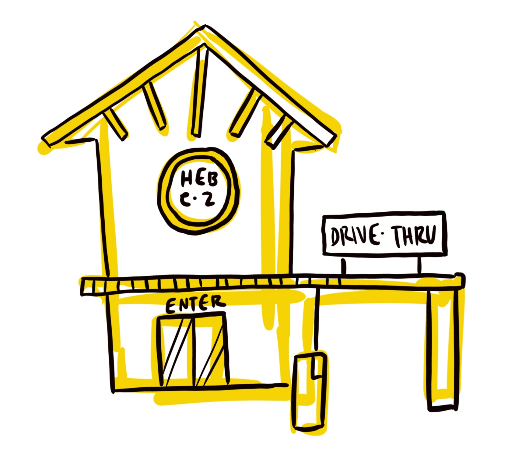
Ecommerce Flow for Brand-New Grocery Store Concept
H-E-B e-z, 2019
Overview
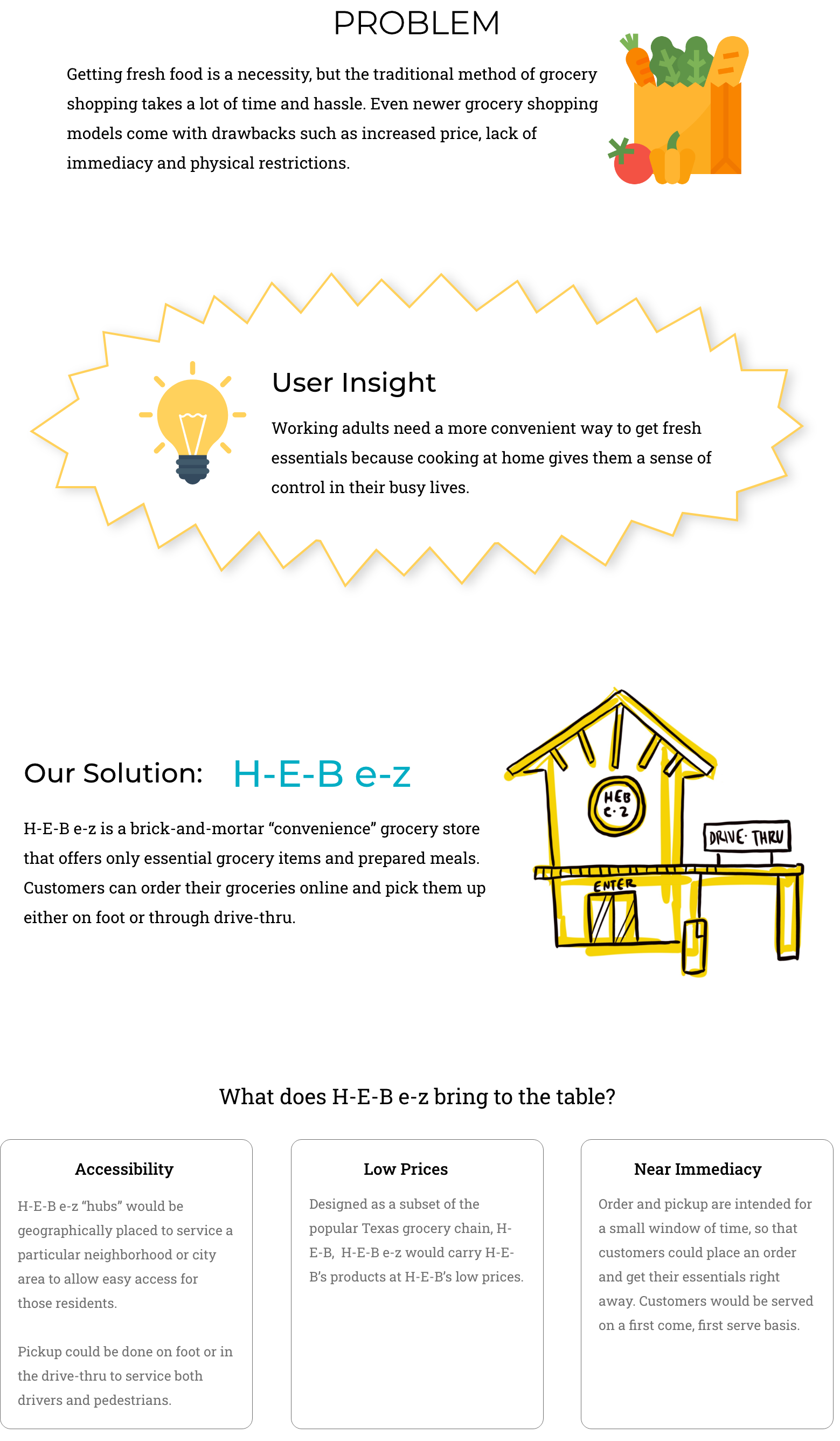
My team and I conceptualized, designed, and coded a responsive e-commerce site for a new grocery store experience intended as a subset of the Texas grocery chain "H-E-B".
Goal
- Flesh out grocery store concept that conveniently serves those on foot or in car in a specific geographic area
- Create e-commerce flow that enables a smooth and speedy grocery aquisition experience
Constraints
- 5 week sprint: 3 weeks design, 2 weeks coding
- 5 person team
- Predetermined e-commerce flows
- No funding
- Keep H-E-B's overall visual feel
My Role
UX/UI Designer
- Research & Testing: in-person interviews, affinity diagram, empathy map, business model canvas, SWOT, AB / Usability testing low-fi prototype
- Ideation & UI Design: user journey map, sketches, wireframes, low to high-fidelity prototyping of Search & Add to Cart flow
Developer
- Coded the Search and Add to Cart flow, consisting of the search results page and three product detail pages

Literature Review
See sources
- There has been a dramatic increase in online grocery shopping in recent years driven largely by millenials (5)
- Online grocery shoppers are more likely to be men ages 18-44 and/or Amazon Prime members (1)
-
Saving time and convenience are key components: (6, 7, 8)
- Prepared meal solutions and meal kits have become very popular due to "time starvation" (6, 8)
- A smaller store = faster shopping experience (8)
- Millennials shop for groceries differently than previous generations: They are not as brand-loyal. Instead of one large trip per week, millenials tend to make quick trips to multiple stores and buy a few items from each (3, 4, 6, 8)
- Millenials have an interest in healthy eating, and though price conscious, are willing to invest in local or ethically-made products (7)
- Grocery shoppers now have an expectation of speed and convenience (7, 8)
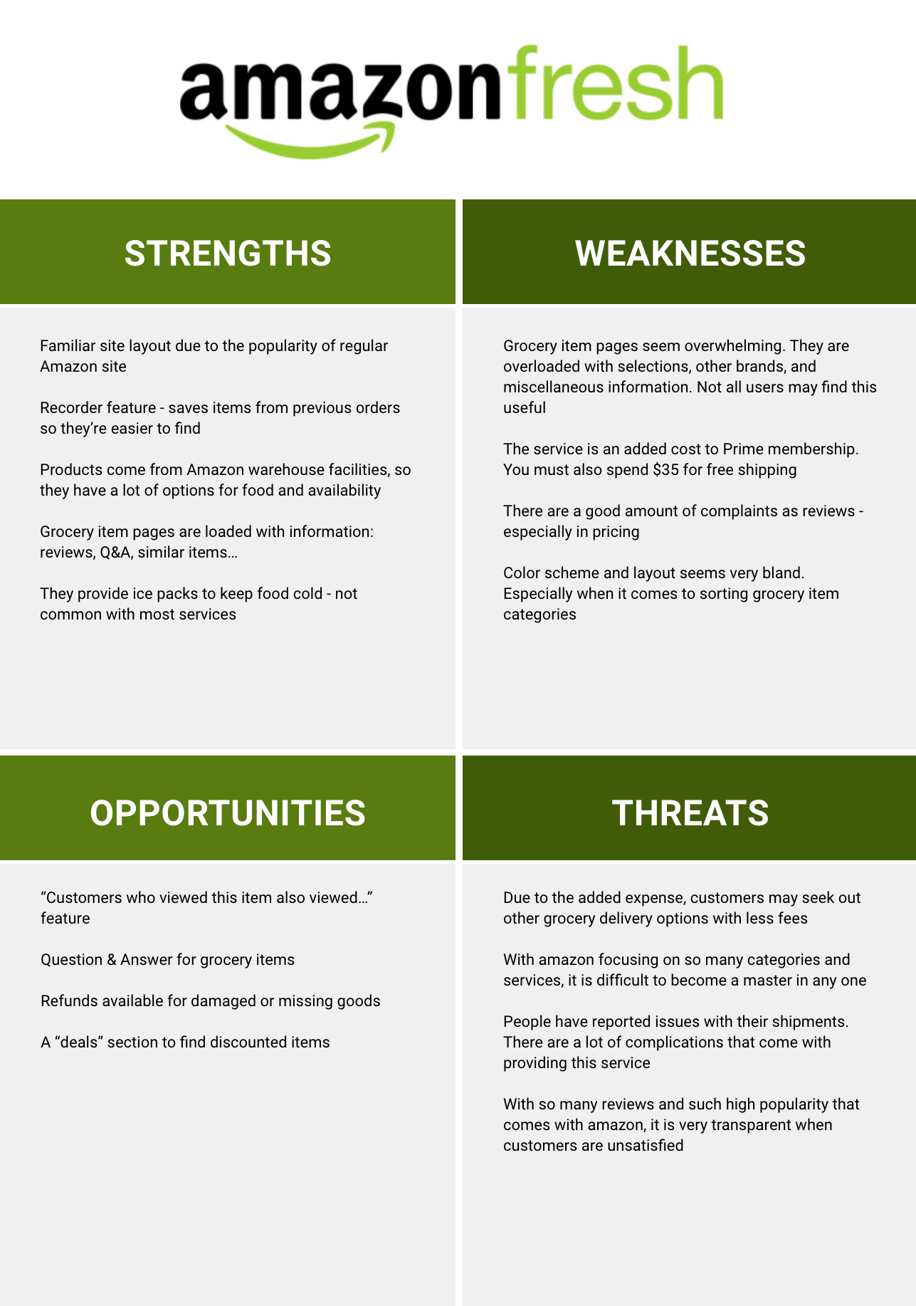
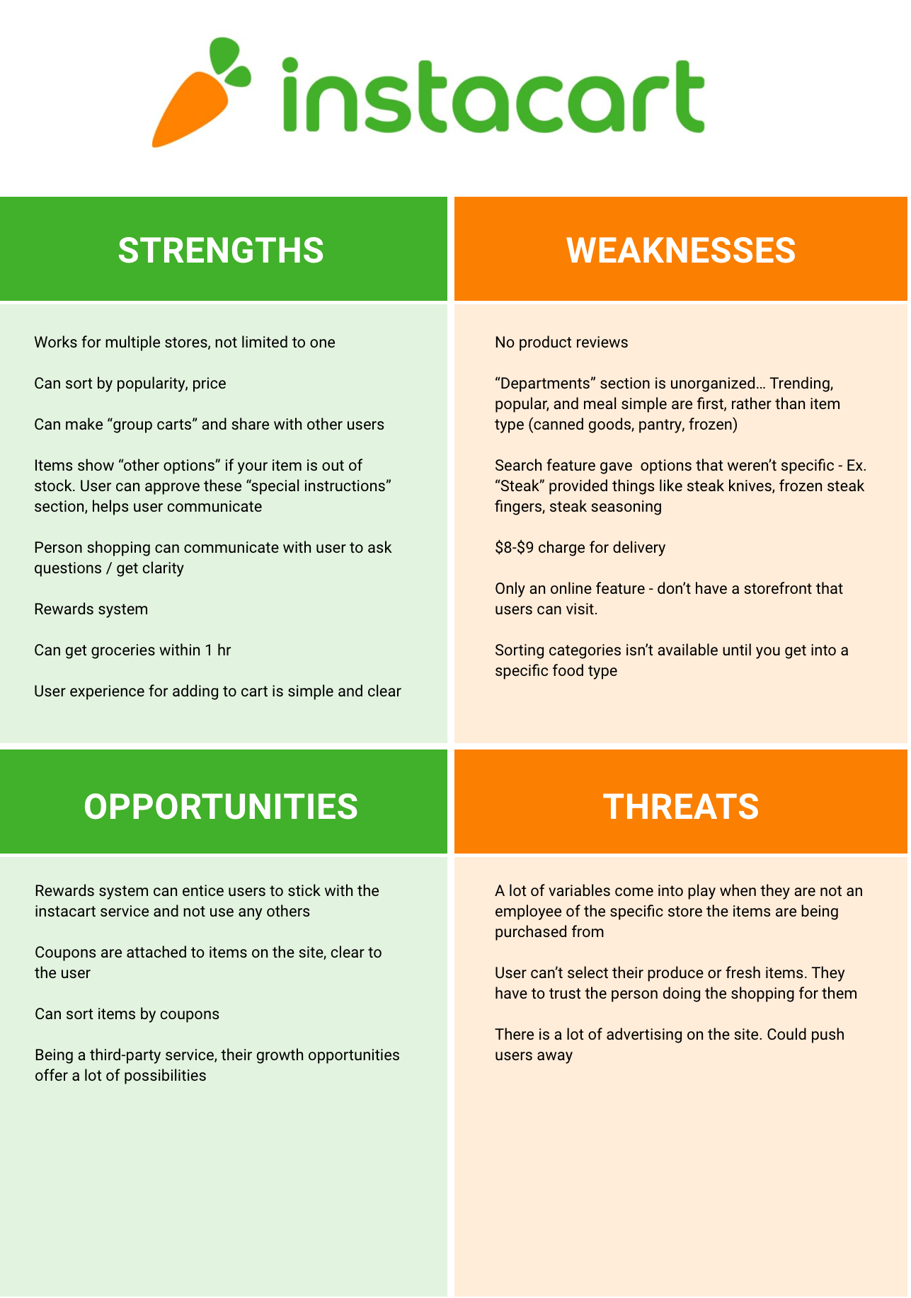
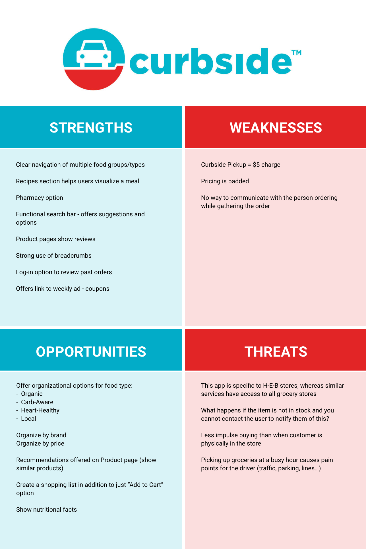
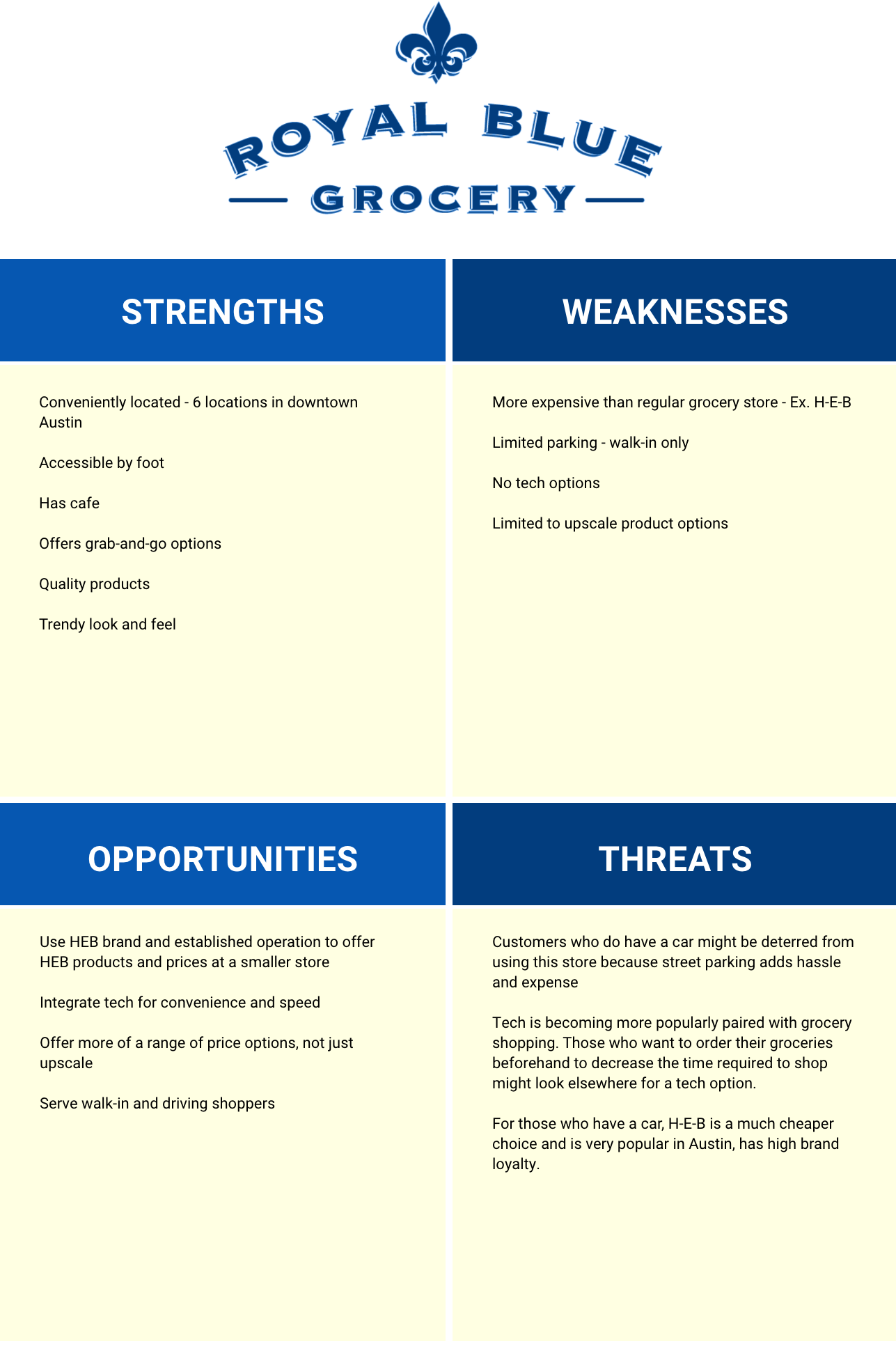
SWOT Analysis
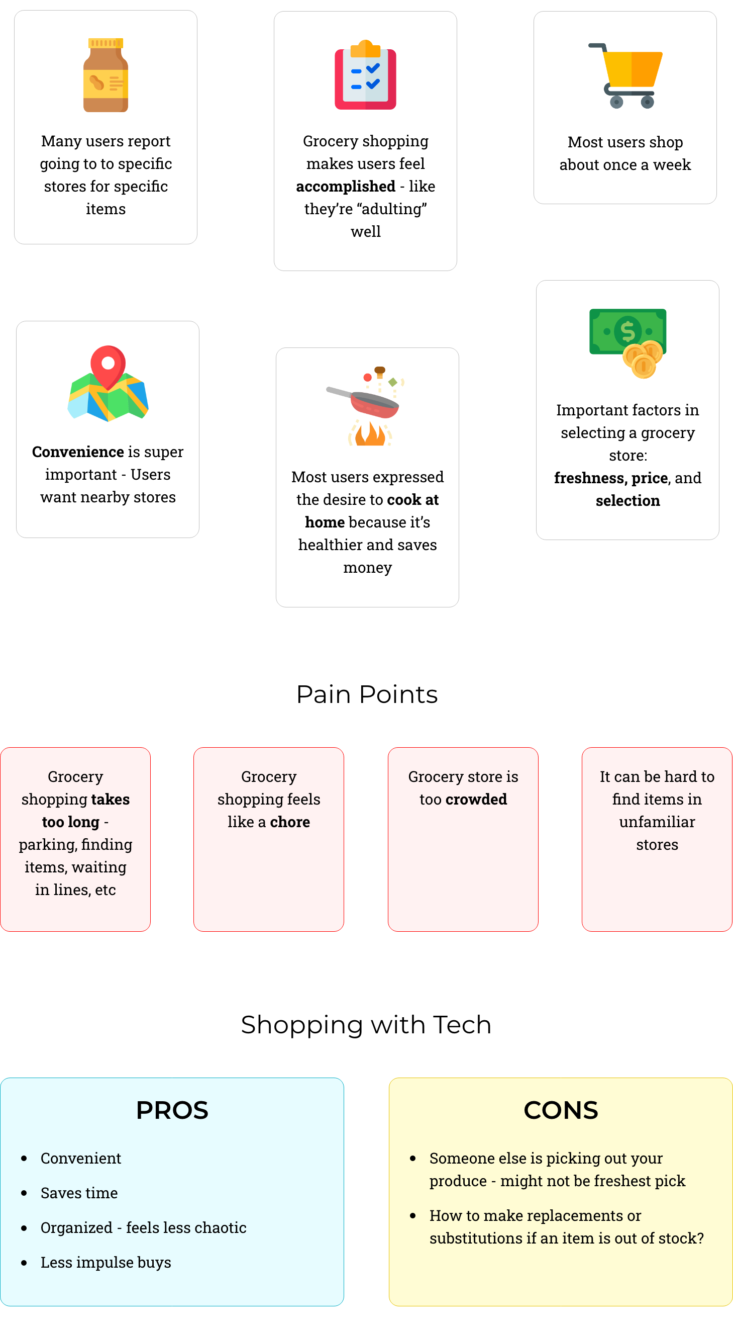
My teammate and I conducted multiple SWOT analyses to help us understand how many people are using tech to grocery shop, and another SWOT on Royal Blue Grocery, which is a frequented grocery option for Austin city-dwellers. Royal Blue has no tech options, but is conveniently located and accessible by foot.
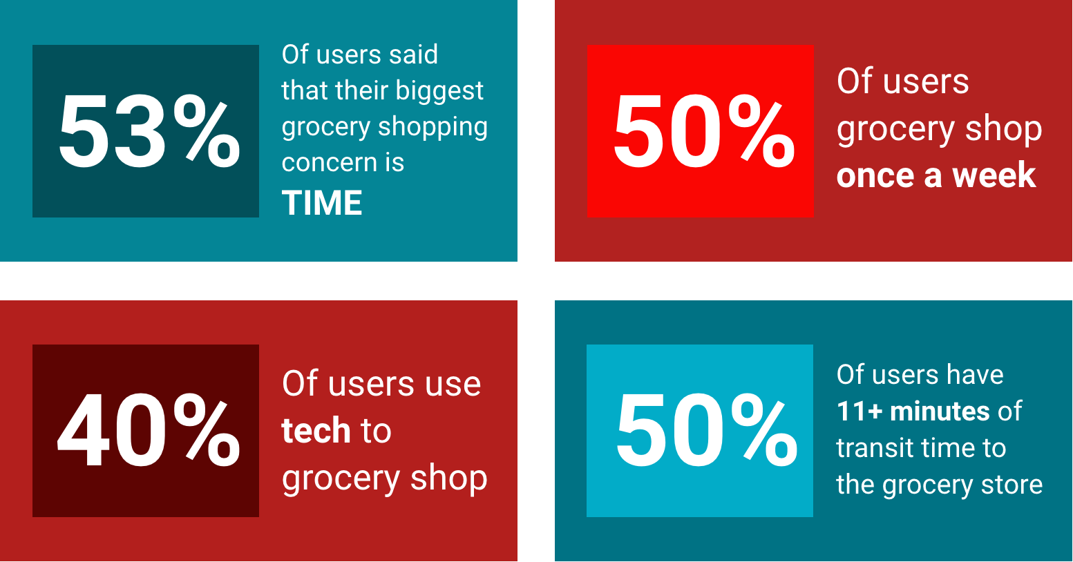
Insights from Survey
100 responses
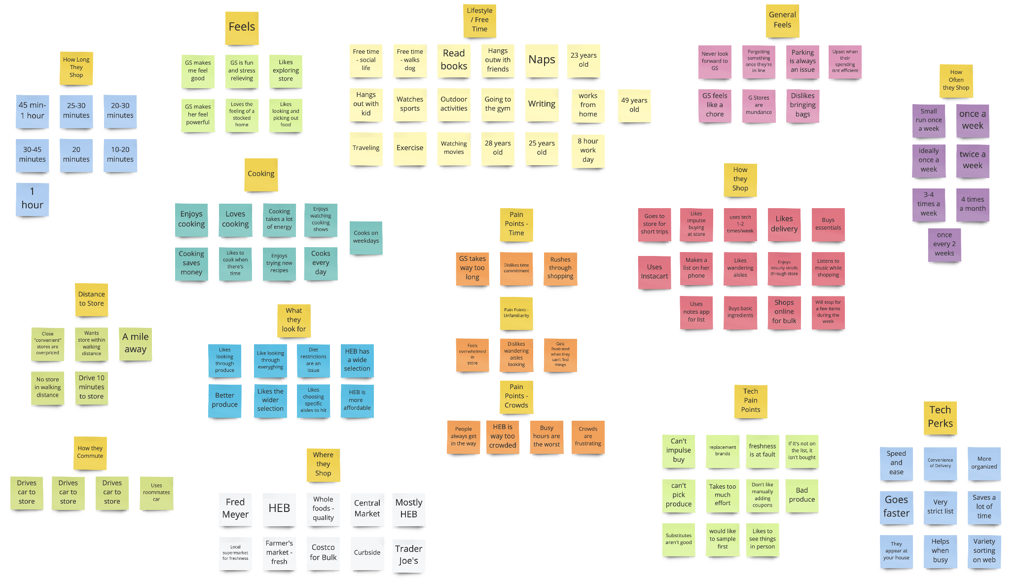
Affinity Diagram
Individually we conducted 6 in-person interviews on male and feamle adults aged 20 to 55 years old. As a team we constructed an affinity diagram through which to seach for trends.
Empathy Map
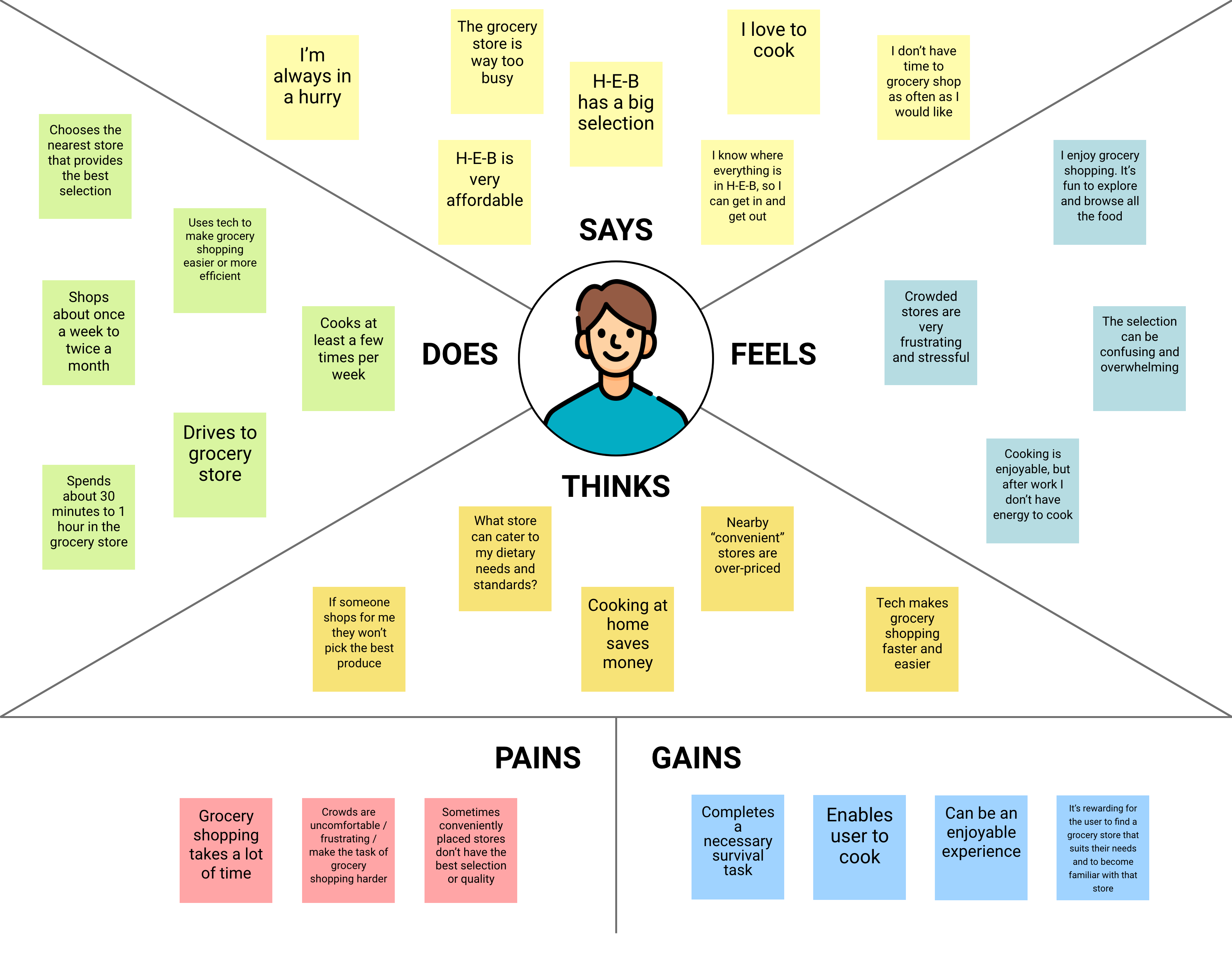
The empathy map underscored people's concern with having control over their own lives. This became evident in grocery shopping sentiments in the way users endeavored to structure their time, their experiences, their health, and their resources. How can the product we are creating give users a greater sense of control in grocery shopping?
Insights from Affinity & Empathy Map

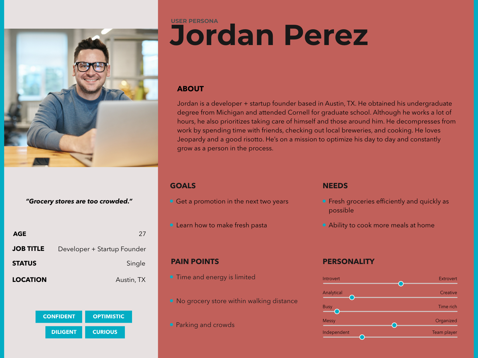
User Persona
We focused our efforts on Jordan, a driven young professional whose main grocery shopping needs are efficiency and health.
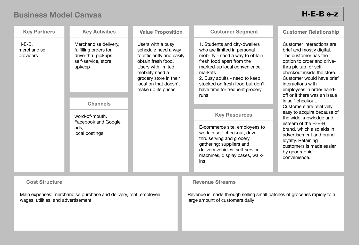
Business Model Canvas
In order to design the e-commerce flow, we had to understand the whole ecosystem that the technology would serve. Through the business model canvas I fleshed out the rough operation concept of H-E-B e-z.
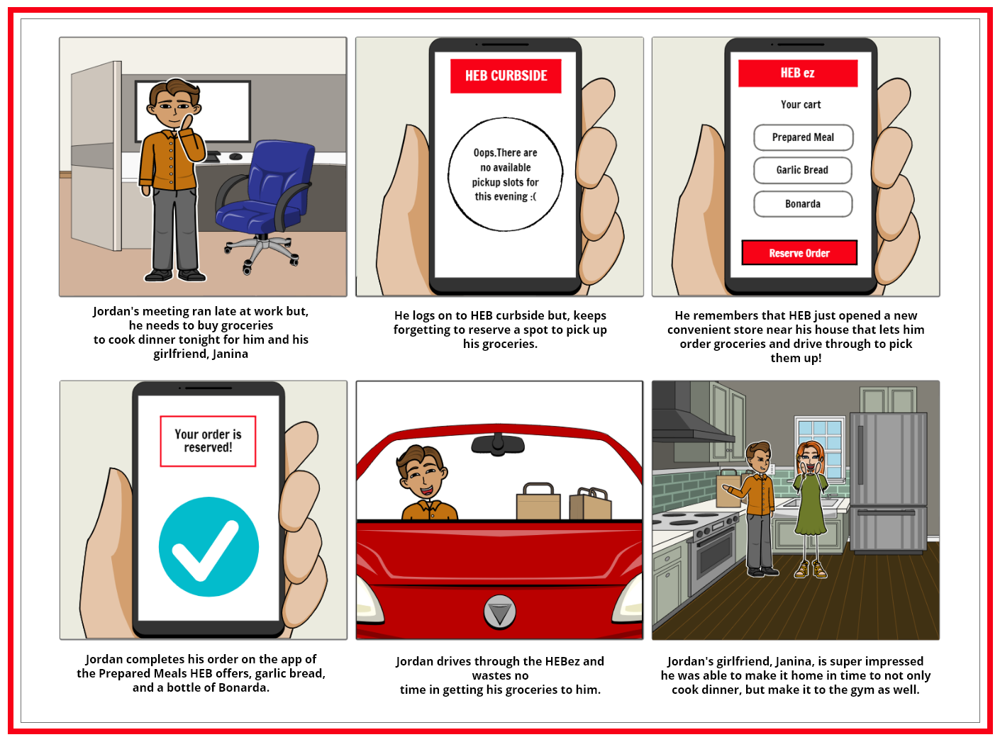
Storyboard
We walked with Jordan through a common situation to see how the site could serve his needs. With the help of H-E-B e-z, Jordan didn't lose precious time to a chore, but spent it where it mattered to him - improving his health and enjoying his relationship.
User Journey Map
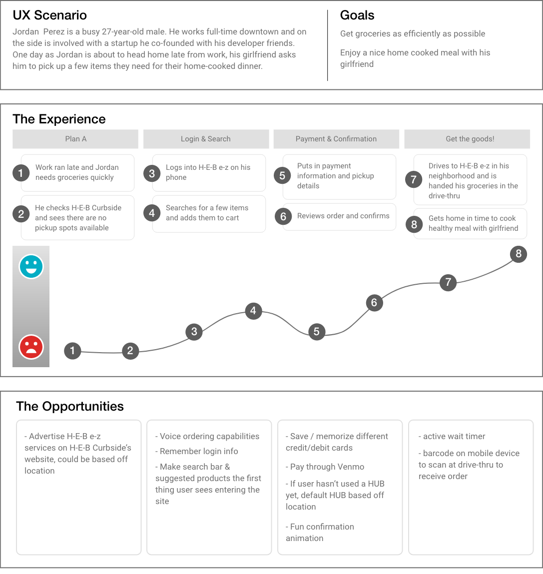
There are potential points of negative emotion when the user has to input information (ex. login and entering payment), and potentially rewarding moments when the user adds to cart and confirms order. Some opportunities to improve the overall emotional experience are:
- Voice ordering capabilities
- Memorize login info; fingerprint login
- Memorizing payment info; being able to save multiple cards (ex. Amazon)
- Pay through Venmo
- Fun annimation when user confirms their order
- Making the search bar and suggested items the first thing the user sees upon entering the app
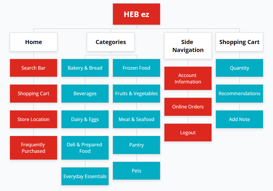
Sitemap
After card-sorting we kept H-E-B Curbside's major categories, but because our focus was on providing basic food essentials we removed the categories of Pharmacy, Recipes, Health & Beauty, Home & Outdoor, and Baby & Kids.
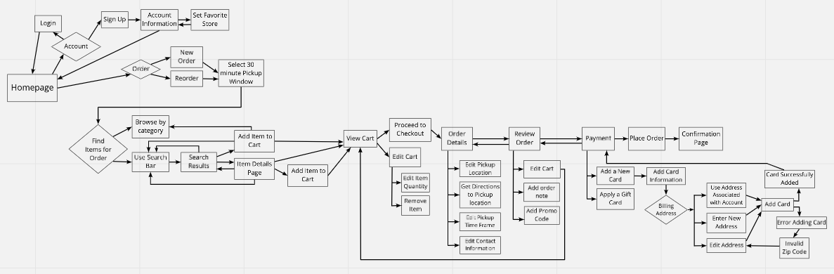
User Flow
Due to the restraints of the project, the three flows for which we were to design were Login, Search & Add to Cart, and Checkout. My focus was on the Search & Add to Cart flow.

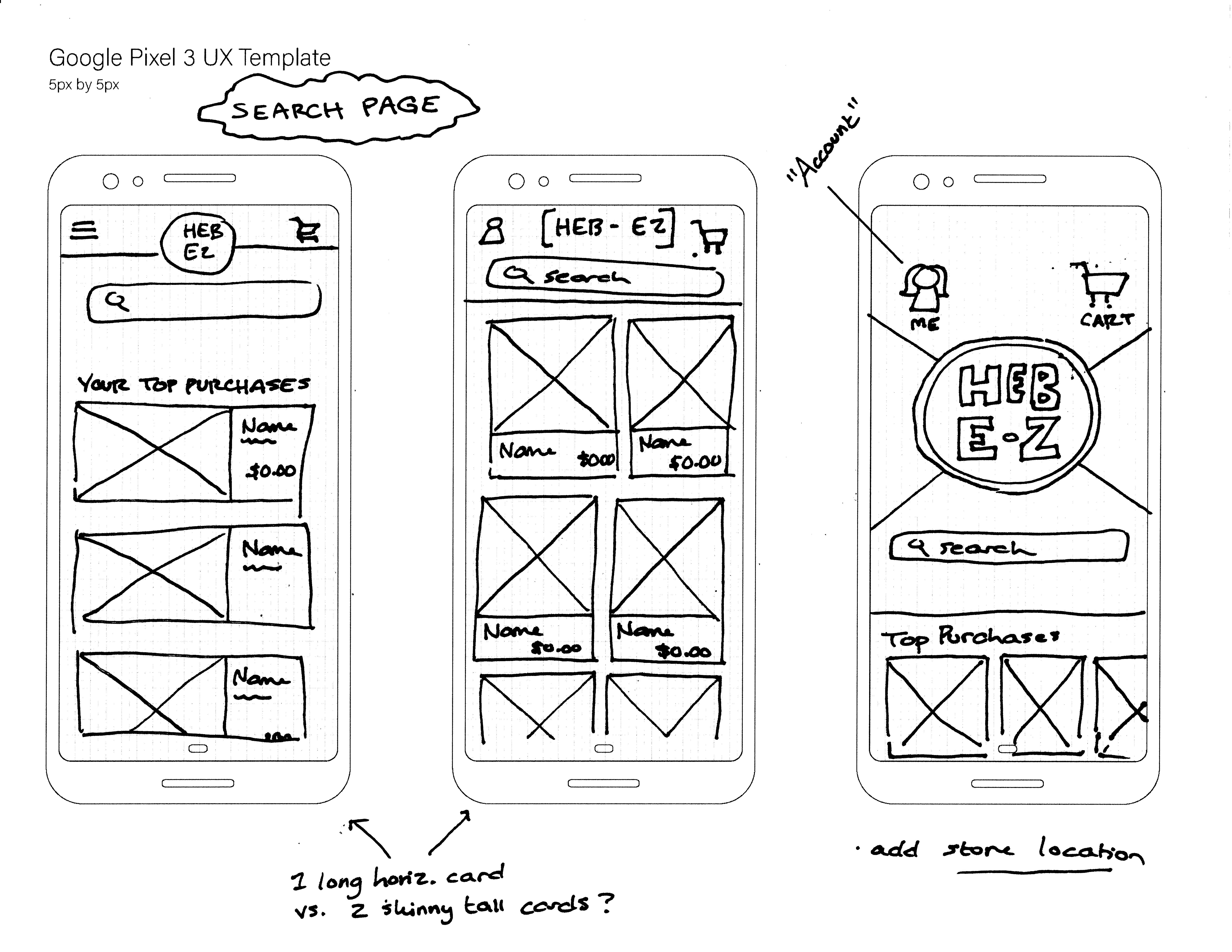
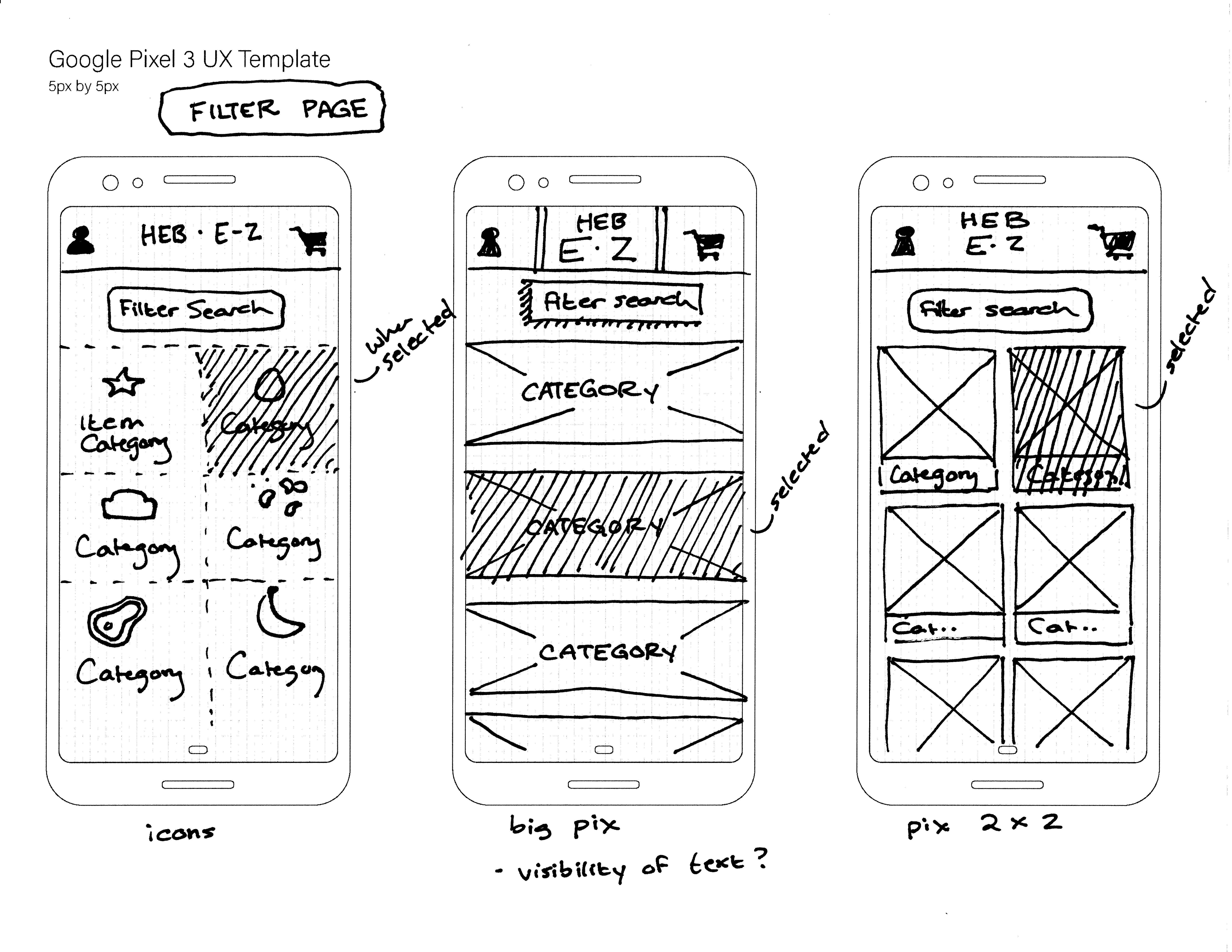
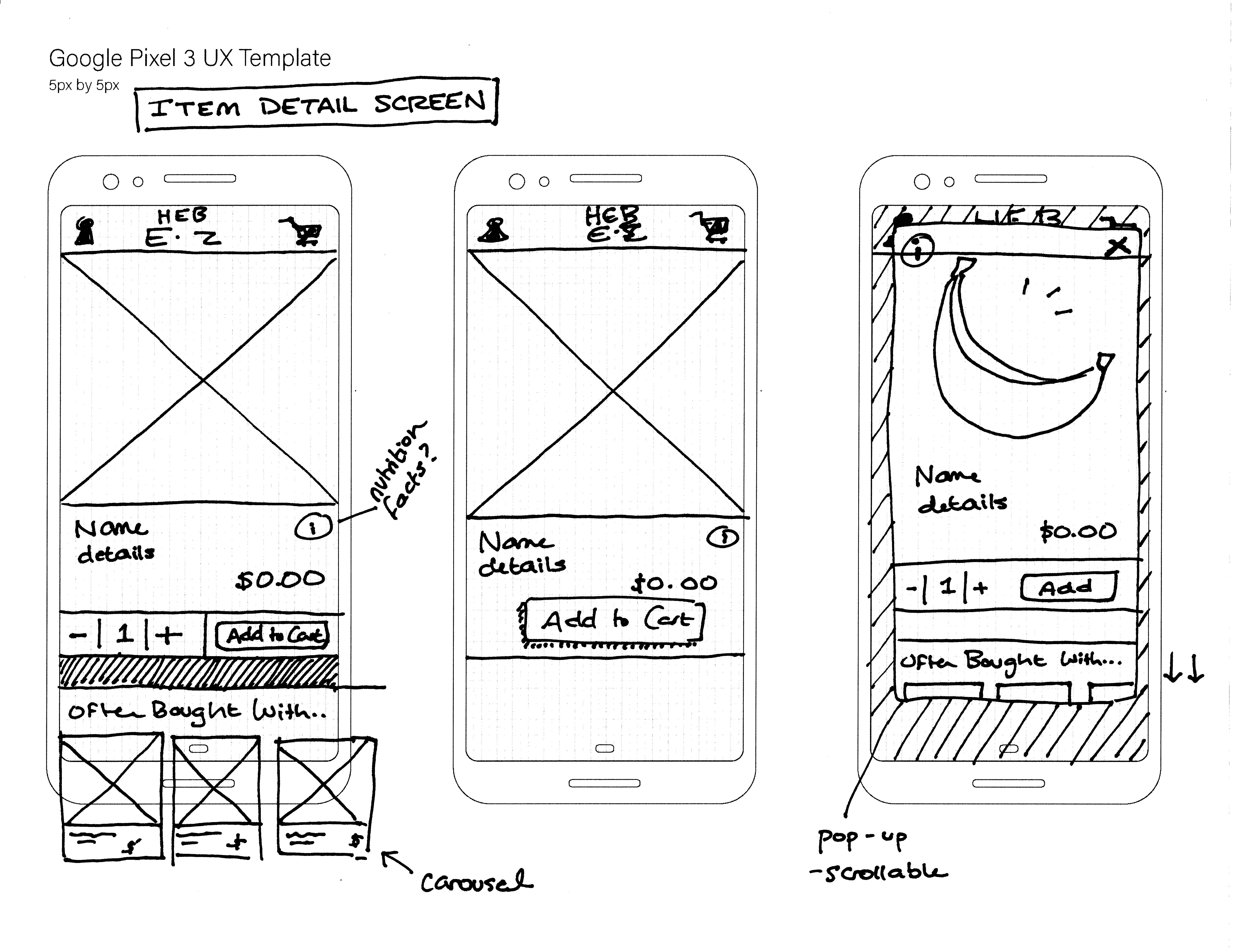
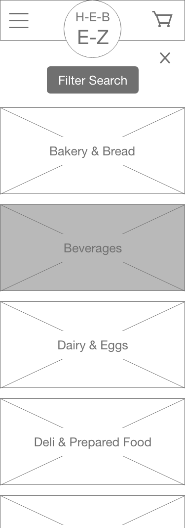
Sketching
I'm quick with pen and paper, so I started by sketching ideas for the home/search page, the filter page, and for the item detail page.
Low-fi Prototype Testing
While testing my low-fi Search & Add to Cart flow, I conducted a small AB Test comparing two filter screens. Seperately I also conducted 2 usability tests once we had combined the three flows. View feedback for combined flows here.
- User 1 thought the "Often Bought With" section was helpful
- Both users easily found the filter button and were comfortable adding quantity to item
- User 1 paused at checkout realizing she had not put in a pickup location. User 2 was confused that she could not place order when she had not entered a pickup location. [Highlight the pickup location form field on cart page, or have user enter location before searching]
- User 1 prefered the big image filter screen because the image makes it "easy to understand". User 2 prefered the icon filter screen because it is "simpler and you wouldn't get lost in the images".
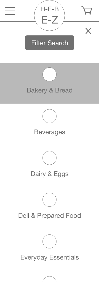
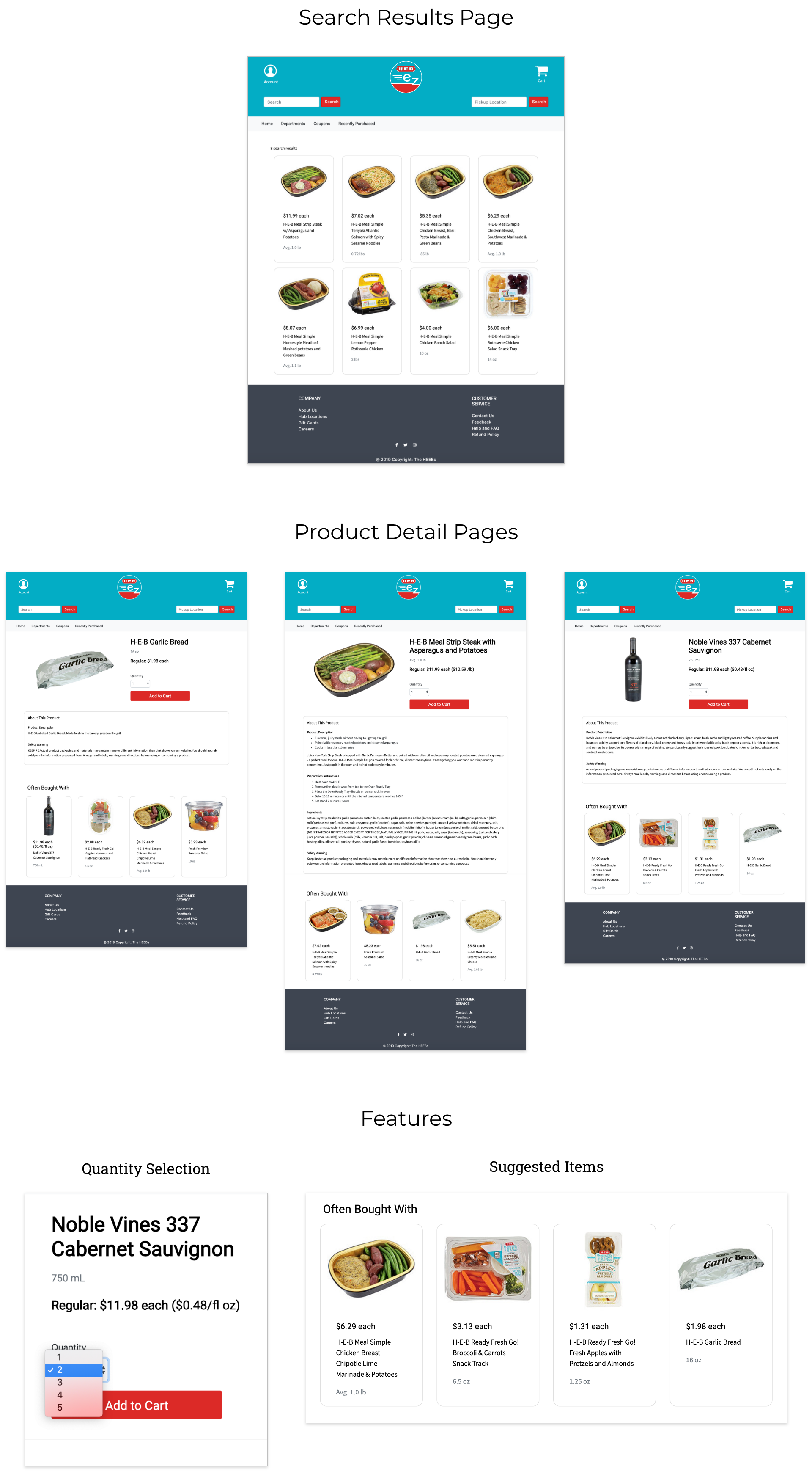
Search & Add to Cart Flow:
UI Style Guide
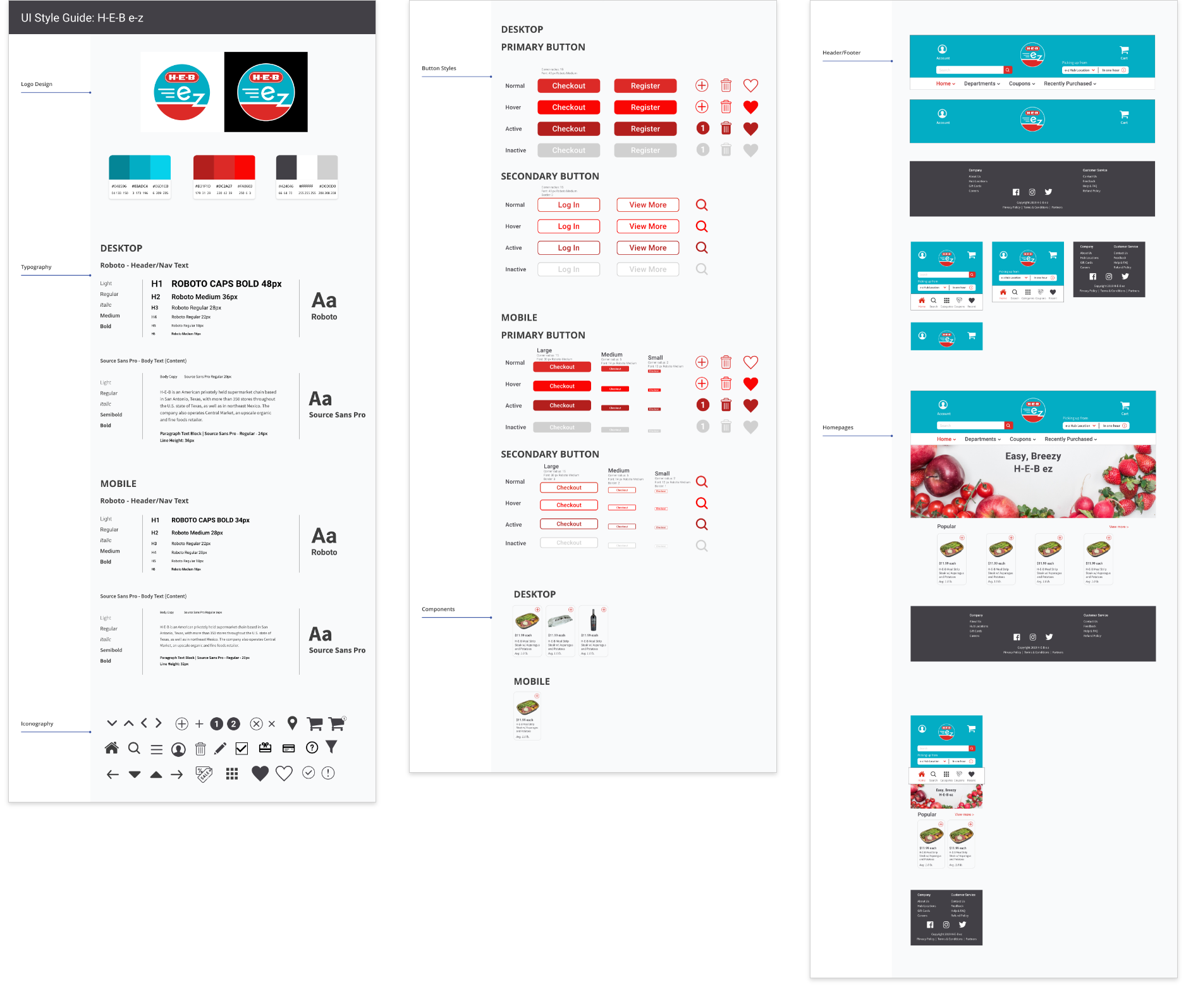
The H-E-B brand is one of the concept's biggest selling points, so we wanted the H-E-B e-z website to retain a similar feel as H-E-B's. We did this by keeping with H-E-B's iconic red and blue, and designing a logo of similar shape and style as H-E-B Curbside's. My teammate created a comprehensive UI Style Guide to allow me and two others designers to work on the different mobile and desktop flows concurrently, while maintaining unity in our design.
Hi-fi Prototype
With the feedback from my usability tests I developed the flow into a hi-fi prototype. Due to the time restraints and prioritized features of the project I chose to put my efforts towards coding this flow instead of implementing the filter screen.
Check out the full hi-fi desktop and mobile prototypes:

Process
- We had two weeks for the coding portion of the project. My teammate, our lead developer, created a github repository and shared it with the team. We all contributed to a spreadsheet organizing our site components, and kept up with our progress through Trello.
- We used bootstrap components but did not use a template.
- I was responsible for coding the pages involved in the Search & Add to Cart flow: 1 search results page and 3 product detail pages.
Takeaways
- Google fu is a lifeline. Coming into this project, no one on the team had ample coding experience. We were familiar with basic HTML, CSS and bootstrap. With only two weeks to code the site, we had to learn how to use the limited knowledge we had to find the right information online.
- Since the project moved so quickly, everyone wasn't always sure of what was being done. This sometimes led to two people doing the same task, clashes over what the "final design" was, and confusion over who was responsible for what. This caused tension that slowed our progress. What helped us was to rigidly keep track of every piece of the project on Trello and having each member update Trello as they completed a piece. We also bettered our coordination through frequent team check-ins to gauge progress or ask for help.